
Most banner ads are ignored. A few get noticed, remembered and clicked. The difference is rarely luck. It comes down to three things you control: the size you buy, the design you put in it and the message you choose. This guide covers all three for advertisers, then shows eight example banners you can open and change in our free banner maker.
Quick answer
- Best sizes to start with: 300x250, 336x280, 728x90, 300x600 and 320x100 (plus 320x50 for mobile reach). These have the most inventory and the best track record.
- Best formats for attention: larger and taller units such as 300x600 and 970x250 stay on screen longer. Full-screen mobile interstitials get the most clicks, but they are also the most intrusive.
- Best design: one message, a big readable headline, a clear button, strong contrast and a visible brand. Less text almost always wins.
- Best measure: judge banners by conversions, cost per result and brand lift, not by click-through rate alone.
Why the creative matters so much
Targeting and bidding get most of the attention in ad tech, but the creative often decides the result. Nielsen research has long found that creative quality is the single biggest driver of sales lift in advertising, ahead of reach, targeting and context. A 2024 study by Ekimetrics for Google, covering 2019-2023 data, reached a similar conclusion for video ads: creative execution is a significant driver of sales performance.
In simple terms, a better banner can do more for your budget than a better audience segment. It is also the cheapest thing to fix.
Size affects two things: how much inventory you can buy (reach) and how much attention each impression gets. Here is how the common sizes compare.
| Size | Name | Where it runs | Strength | Watch out for |
|---|---|---|---|---|
| 300x250 | Medium rectangle | Desktop and mobile, in content | Most inventory, works almost everywhere | Very crowded, needs a strong design to stand out |
| 336x280 | Large rectangle | Desktop, in content | A bit more room than 300x250, similar placements | Less supply than 300x250 |
| 728x90 | Leaderboard | Desktop, top of page | Seen early on the page, good for reach | Very little height, keep the text short |
| 300x600 | Half page | Desktop sidebars | Large, often sticky, long time on screen | Costs more per thousand impressions |
| 970x250 | Billboard | Desktop, top of page | High impact, good for launches and brand campaigns | Limited supply, mostly premium sites |
| 160x600 | Wide skyscraper | Desktop sidebars | Cheap reach, often sticky | Narrow, hard to fit a headline |
| 320x50 | Mobile banner | Mobile web and apps | Huge reach on mobile, often anchored on screen | Tiny, easy to ignore, prone to accidental clicks |
| 320x100 | Large mobile banner | Mobile web | Twice the height of 320x50 for a small price change | Less supply than 320x50 |
Google lists 300x250, 336x280, 728x90, 300x600 and 320x100 as its top performing ad sizes. The first three have the most demand and supply. The 300x600 is one of the fastest growing sizes, because brand advertisers like its bigger canvas. Media agency research also shows that tall units like the 300x600 stay in view the longest, while wide units like 970x250 and 728x90 have high in-view rates but are scrolled past quickly.
Practical rule: design every campaign in at least 300x250, 728x90, 300x600 and 320x50. That covers most of the open web. Add 970x250 and 320x100 if you have the budget and want more impact. See our full banner ad sizes guide for specs.
People do not read banners. They glance at them for a second or two while doing something else. Good banners are built for that glance.
- One message. Pick one offer or one idea. "30% off winter jackets" beats a list of three product benefits.
- A short, big headline. Aim for 3-7 words. If it does not read at arm's length on a phone, it is too small.
- Make the brand visible. Many people will never click, but they will still see the ad. If they cannot tell who it is from, the impression is wasted. Put the logo or brand name where it is easy to spot.
- A clear call to action. Use a real button shape with a specific verb: "Start free trial", "See fares", "Get my box". "Learn more" is the weakest option.
- Strong contrast. The headline and button must stand out from the background. Most failed banners have too little contrast, not too few colors.
- A concrete reason to act. A price, a discount, a deadline or "free" gives people a reason to click now.
- Space. Empty space is not wasted. It makes the important parts easier to see.
- Light motion only. A short animation (a button shine, a headline sliding in) can catch the eye. Keep it under 15 seconds, end on a clear final frame and avoid flashing.
- Fit the size. Do not just shrink a 300x250 into a 728x90. Wide sizes need a left-to-right layout, tall sizes a top-to-bottom one.
- Match the landing page. The page people land on should repeat the offer from the banner. A mismatch kills conversions.
"Best" depends on your goal. Here is a simple way to match the banner to the job.
| Goal | Banner type | Sizes | Measure with |
|---|---|---|---|
| Direct sales | Offer banner: product, price or discount, strong button | 300x250, 320x50, 300x600 | Cost per sale, return on ad spend |
| Sign-ups or trials | Benefit banner: one clear benefit plus "free" or "no card needed" | 300x600, 300x250, 728x90 | Cost per sign-up |
| Retargeting | Reminder banner: the product they viewed, a small incentive | 300x250, 320x50 | Incremental conversions, not just last click |
| Brand awareness | Big visual, short line, strong brand | 970x250, 300x600 | Viewable reach, brand lift studies |
| App installs | App name, one benefit, "Install" button | 320x50, 320x100, 300x250 | Cost per install, then cost per active user |
A note on clicks: average display click-through rates are low, often well under 1%. A banner with a low click rate can still drive sales through people who see it and buy later. On the other hand, small mobile banners can get a lot of accidental clicks that never convert. That is why you should look at conversions and cost per result, and use our media budget calculator to see what results a budget can realistically buy.
Want banners that look like real shop ads, with product photos, prices and slides? Try our free Banner Studio: ready-made templates for product deals, weekly offers, Black Friday sales, photo slideshows and lookbooks, with several click links in one banner and animated HTML5 export.
All of these were made in our free banner maker for fictional brands. Each one follows the rules above. Click "Open in the banner maker" under any example to load the same design, then change the text, colors and size and download a PNG, JPG or animated HTML5 file. You can also upload your own logo and background photo.
1. Retail sale, 300x250
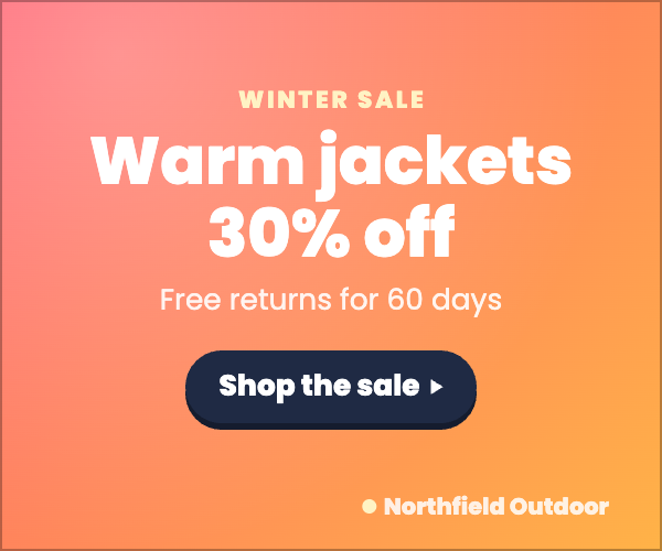
The offer is the headline. Warm colors stand out on most news and lifestyle pages, the button uses a dark color for contrast, and "Free returns" removes a reason not to buy.
2. Free trial, 300x600
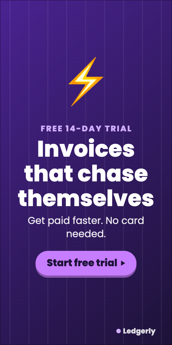
The tall format gives room for a bold benefit-led headline. "No card needed" lowers the barrier, and the button says exactly what happens next.
3. Flight deal, 728x90

Wide sizes read left to right: headline, then button. A specific route and price beat a generic "Cheap flights" line, and "Book by Sunday" adds urgency.
4. Food delivery, 320x50

On the smallest mobile size there is room for one line and a button. Keep the font large and the offer simple.
5. Product launch, 970x250
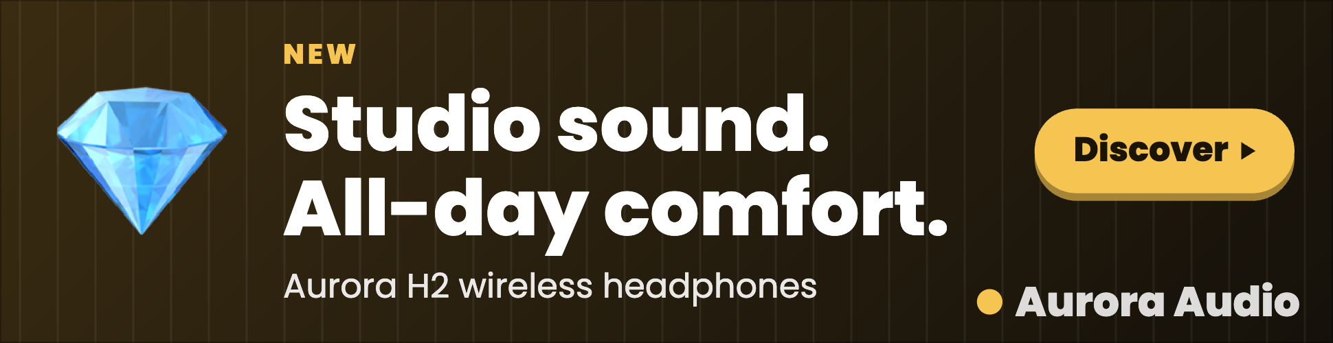
A brand campaign: a short, confident line, the product name and a strong brand mark. The billboard size makes it feel premium.
6. Subscription, 336x280
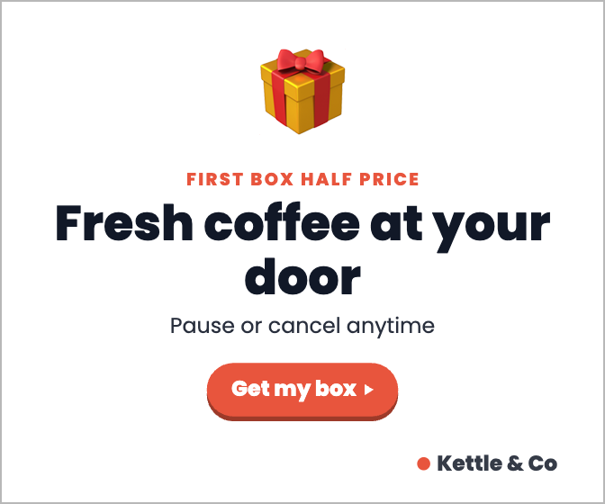
A light design stands out on dark or busy sites. The incentive sits above the headline and "Pause or cancel anytime" handles the main worry about subscriptions.
7. Online course, 160x600

Narrow sizes need short words stacked top to bottom. A clear time frame ("30 days", "15 minutes a day") makes the promise concrete.
8. App install, 320x100
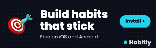
The large mobile banner has room for the app name, one benefit and an "Install" button. Mention both stores so nobody wonders if it works on their phone.
Common mistakes
- Too much text. If your banner has more than about 15 words, cut it.
- A hidden brand. A tiny logo in a corner means most viewers never learn who the ad was for. Use the logo upload in the banner maker and make it a sensible size.
- Only one size. Running only 300x250 limits your reach and pushes up prices. Build the full set.
- Never testing. Run two or three versions with different headlines or offers, then keep the winner. Change one thing at a time.
- Heavy files. Keep static files small (under about 150 KB) and HTML5 banners light, so they load fast and pass ad network checks.
- Running on poor sites. Even a great banner fails on cluttered, made-for-advertising sites. Read our guide on made-for-advertising sites and check sellers with our sellers.json lookup.
FAQ
The 300x250 has the most reach. The 300x600 usually gets the most attention per impression. Most campaigns should run both, plus 728x90 and 320x50.
Light animation can catch the eye and often helps, but it is not automatic. Keep it short, end on a clear frame with the offer and button, and test it against a static version.
As few as possible. A headline of 3-7 words, an optional short line under it and a button is enough for most banners.
For standard display, anything around 0.1%-0.5% is common, and it varies a lot by format, site and audience. Conversions and cost per result matter more than CTR.
Yes. Our free banner maker works in your browser, has no sign-up and no watermark, and can export one design in many sizes as a single ZIP. For ready-made layouts, see our banner templates.
Sources
- Google AdSense: Guide to ad sizes
- MNI: Display ad sizes, do they really matter?
- Ekimetrics and Google: creative quality and ad ROI (2024)