


Figuring out the best mobile ad sizes can be tricky and a lot depends on the layout of the website/blog or an app and the positioning of specific banners. While it might make sense to use banners that are short in height while keeping the users happy often just a few pixels can make a massive difference in eCPM (revenue per thousand impressions) or CPC (cost per click).
In this article we will look at different ad sizes and how you can really squeeze as much revenue out of them as possible with very little modification needed. Of course, we know that each device has its own width of the screen so we have to consider the maximum available size to place on the website without messing up the layout. By providing you with the available free tools (not sponsored) you will be able to go out there test and analyse everything on your own.
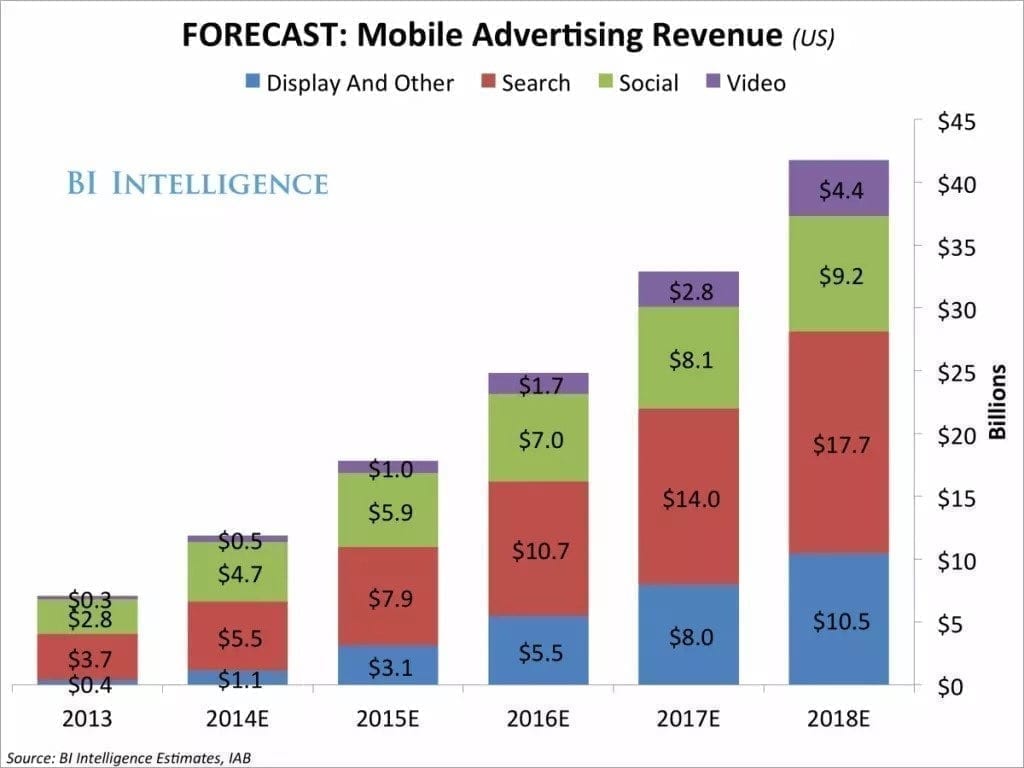
Here is a good example (Image 1.) of why you should understand mobile ad banner sizes to bring in as much revenue as possible. Mobile has been taking over, not really a surprise but it is a great motivator on learning how to maximize your profits and be in front of everyone and leading the way.
Official Industry Approved Ad Sizes
First, let’s have a look at what three official websites are saying about the ad sizes before moving on to some real life examples. You will notice that they are all quite similar in sizes and suggestions, but we do not want to place them all at once on our websites. Primarily we want to place the best paying mobile ad units.
IAB
Interactive Advertising Bureau (IAB) is an official advertising organisation that develops and creates industry standards including ad sizes, specifications and guidelines. IAB conducts research, and provides legal support for the online advertising industry to thrive the digital economy.
Based on these specifications, for mobile we should be using such sizes:
- Medium Rectangle – 300×250.
- Feature Phone Small Banner – 120×20.
- Smartphone Banner – 300×50 or 320×50.
- Feature Phone Medium Banner – 168×28.
- Feature Phone Large Banner – 216×36.
Google Adsense
It is suggested that you place ads on your website with specific sizes. This in turn will let you know and understand exactly where they will appear and in what dimensions. In turn this gives you more control. Whereas auto-ads is quite random and will place ads in positions you might not want them to be at. A bad example would be a random sticky on top of the page in front of the navigation bar.
You should be aware of what are the best mobile ad sizes for your specific website/blog layout and design.
Each template and page might require different dimensions. This will help you with identifying what works for you the best. Such modifications will provide you with better and more specific reporting statistics.
For example, if you see that 320×100 works better or the same as 300×250, why keep the larger banner? It can be that 336×280 works better than 300×250, only a few additional pixels can change a lot.
Mobile ad sizes can also depend on the country and language of website/blog. Meaning that advertisers might be used to buying banners in different dimensions. Here is a list of sizes what Google suggests to use generally.
Lets check what fixed default mobile ad sizes Adsense supports:
- Horizontal
- Large mobile banner – 320×100,
- Mobile banner – 320×50.
- Rectangle (does not suggest it is mobile but can be used on all devices including desktop)
- Large rectangle – 336×280,
- Medium rectangle – 300×250,
- Square – 250×250,
- Small square – 200×200.
- Responsive banner.
Medialets- Integrated into GroupM
GrupM is the largest media investment group, globally directing more than $48 billion in annual advertising, Medialets (mobile ad platform) was acquired by them in 2015. In simple words this means they have data, a lot of it. So let’s have a look at it.
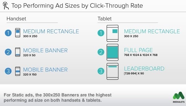
In the Image 1. Medialets suggests that the top performing ad sizes by click through rate are following:
- Medium rectangle – 300×250,
- Mobile banner – 320×50,
- Mobile banner – 320×150. (previous two reports did not have this size)
Real Life Examples
We suggest to additionally having a look at websites/blogs that are similar to what you have in mind. If you own a travel blog just have a look at what your competitors or friends are using, the same goes for any type of website or product.
Wappalyzer
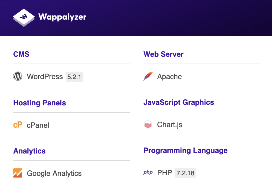
Additionally you can check what websites use the same framework as yours (for example WordPress as they might be using the same template/layout) and see how they have implemented their ads. Here is a great plugin that we like to use to check what products everyone is using: Wappalyzer. In Image 3. you can see how it looks and works. Once installed in will appear in top right corner and to activate it on any site just click on the icon.
How to Check Mobile Ad Sizes From a PC
Let’s say you have found the perfect example of how you would like your website to look from mobile. To check exactly what ad sizes the other websites/blogs are using you just need to do the following (in this example using Google Chrome Browser):
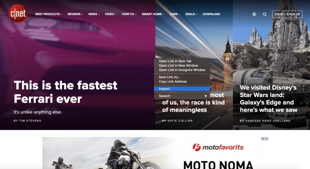
- Find the website, for this example let’s use cnet.com.
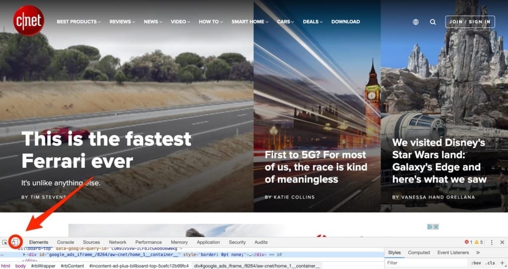
- Press the right mouse button and click on inspect element. (Image 3.)
- On left bottom corner there is a small icon that has a display image in it (looks like a small tablet and a smartphone). (Image 4.).
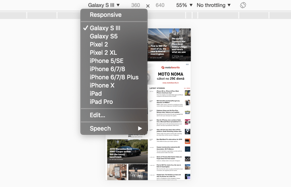
- “Toggle device toolbar”
- Now you are in mobile. (Image 5.)
- Pick a device you wish to use.
- Refresh the page.
- Wuola!
- Now next to the “mobile icon (look at the item in the list nr 3.)” there is an icon saying “Select an element in the page to inspect it”.
- Now as you see in Image 6. after you click on the banner on the page you will be able to see the size of the banner.
- In this case it is 360×180 and lower on the page rest of the banners are 300×250.
- It is not rare to use a smaller banner on top and 300×250 for the rest of the banners after each section of the page for maximum efficiency and better user experience.
- Now as you see in Image 6. after you click on the banner on the page you will be able to see the size of the banner.

What we suggest based on facts and examples
The perfect scenario would be if you are using some sort of ad server, for example DFP (now known as AdManager) where you can add multiple sizes to one position and let it pick the best paying one. Later you would be able to see in the reports which ad size was delivering the best revenue – eCPM and CTR. If this is the case, we suggest to run 320×320/336×280/300×300/300×250 for maximum CTR (higher % of CTR will result in higher eCPM).
If you only use Adsense (there are alternatives, even better ones out there) we suggest you place each size for the same position and test which one works the best. Start with 336×280 and go down to 300×250 or even 320×100/50. Keep in mind that the most popular ad size 300×250, so in most of the cases it will generate the best revenue.
Remember that the lower the banner tag is, the smaller the view-ability % (the time the ad has been visible to the user) therefore resulting in smaller revenue. If this is the case we suggest that you run the ads on the page with “lazy load” enabled, this means that the ad would only load when the user has it visible on the screen therefore increasing the overall eCPM of the whole website. Advertisers will appreciate this and of course pay more.
Conclusion
We can look at the statistics and graphs all we want, while it can give us a good starting point we will not be able to squeeze as much revenue as possible by only trusting outside data. Each website is unique, visitors are different and geographies’ are diverse. Look at competitors, similar websites and analyse them. While mobile is on the rise do not forget to also optimize your desktop version of the website/blog.
You now have all the tools and information, go out and test it.